Rebranding is a delicate balancing act. On one hand, you want to expand your horizons a bit and reach brand new customers. On the other hand, you risk alienating those who’ve always been around. Discord found this out when it decided to surprise users with a new logo yesterday, doing away with its unique lettering in favor of something more plain. Needless to say, many Discord users are not big fans of the change.
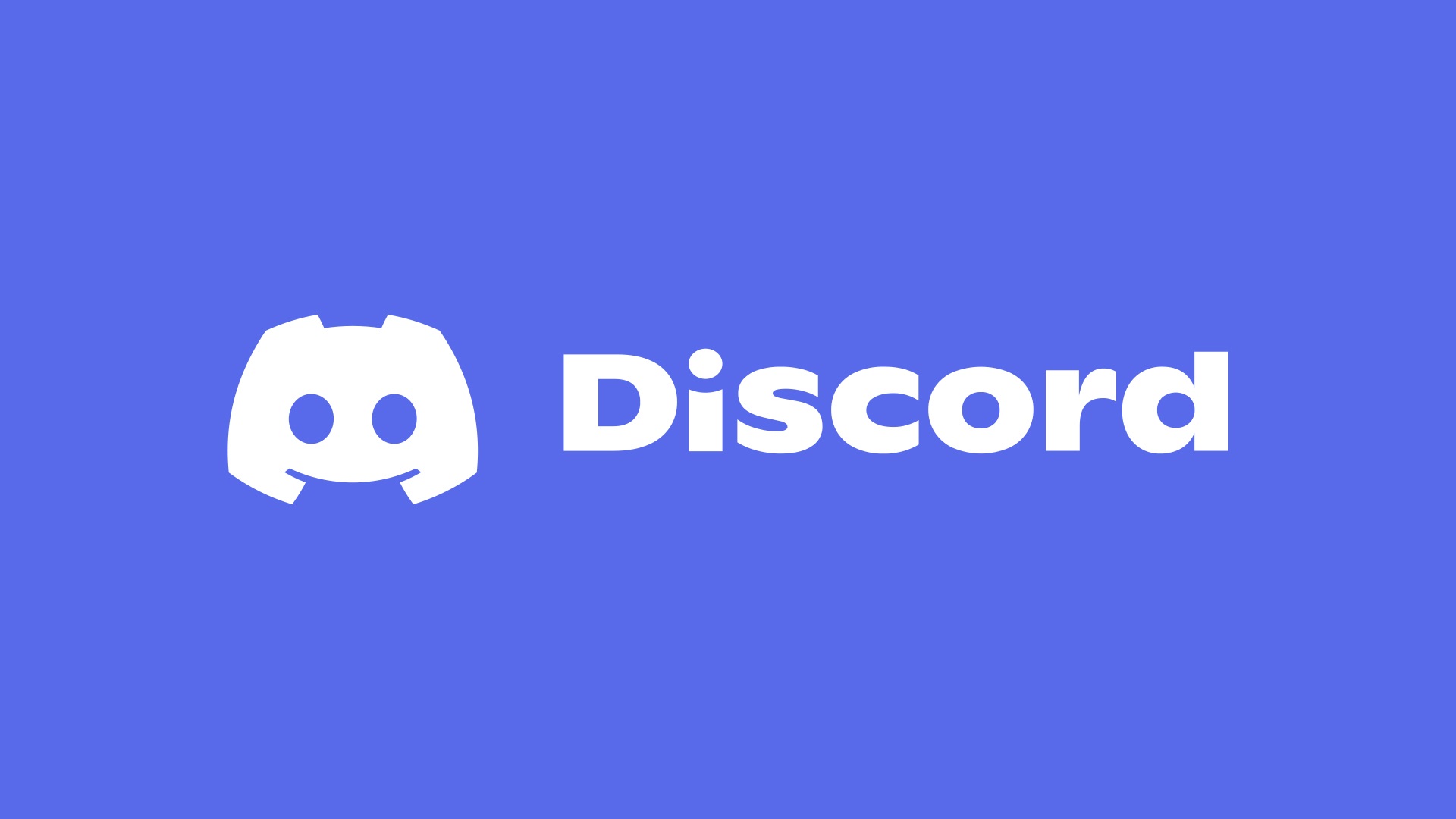
To start, here’s the tweet where Discord announced its move to a new logo.
And here is what one user had to say about the new logo in relation to the old one.
Another user really went to down, criticizing the “bland” font and the icon, which they felt was “oversimplifying an already simple design.” Another still complained of the “harsher color” — the darker blue.
To its credit, Discord has taken all of this feedback pretty well. A number of people have requested some kind of theming option so that they can go back to the old look with the old logo, and the company seems at least willing to consider it. That’s probably a wise move if the mission is to still go forward with the rebrand while attempting to mitigate the negative chatter.
Hopefully Discord has learned a lesson here, though; one a whole bunch of other companies can take away, too. When people feel invested in your platform, and feel like they’ve played an integral role in shaping it, they typically don’t appreciate surprises like this. It probably would’ve been better for Discord to involve its community a bit earlier — just to make users feel like they had a say in the matter.
We’ll keep an eye on this and let you know if anything changes re: logogate.


